Our Brand
Our Brand
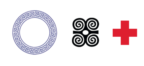
Our logo/ registered trademark combines aesthetically the Greek key/ meander which signifies an eternal flow, the Adinkra symbol for Strength (ram’s horn) and the red cross- the universal symbol for healthcare. The mark draws from the heritage of the historical city of Acre. It is an amalgamation of Greek and Ghanaian patterns with negative space connoting the line of business.
Font choice complements the mark with squarish san serif fonts that have rounded corners to give it a soft nurturing touch. The use of a soft green also draws from the story of healing herbs in the Acrecity narrative and has a therapeutic calming effect.